
Team Overview: Rankings and the 7-Day Trend
The Rankings & trend tab of the Team Overview page answers a simple management question: how much did the team actually work in the last 7 days, and who worked the most and the least? To keep the comparison fair, every number on this tab covers the last 7 complete days — today is deliberately excluded, because a day still in progress would distort averages and rankings.
Team hours per day is a bar chart of total tracked time for each of those 7 days. It makes weekly rhythm visible at a glance: normal working days, weekends, and any day where team output suddenly dropped.
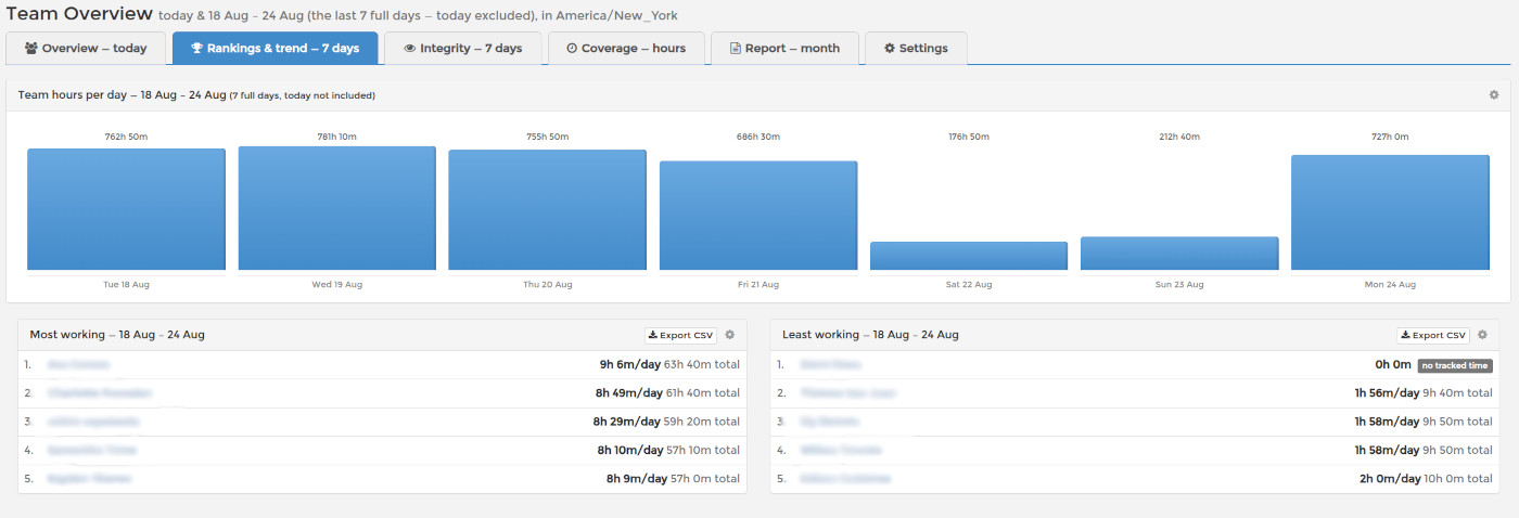
Most working and Least working rank your employees by tracked time over the same window. The headline number for each person is their average per active day — a fairer measure than the raw total, because someone who worked three intense days is not ranked below someone who spread the same hours over seven. The raw weekly total is shown alongside.
The Least working list intentionally includes employees with zero tracked hours. If someone silently stopped tracking — or stopped working — this is where you notice, making the list a practical early-warning tool for attendance problems in remote teams. Both lists export to CSV.
A low number is a reason to look, not a verdict: open the person's work log, check their projects and notes, and talk to them. Meetings, calls and offline work do not appear in tracked time.